UMA Partner Sites
Some other sites under the UMA umberella that we did...
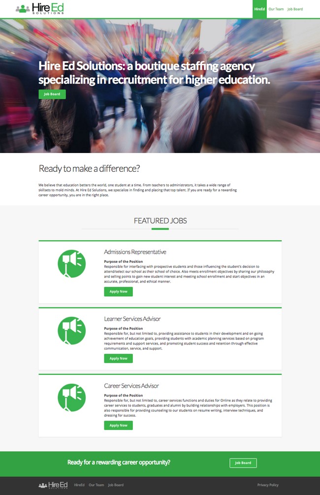
Hire Ed Solutions


We added roll-over images to each of the profiles to reveal an aspect of that person's character.
A little bit of whimsy goes a long way.
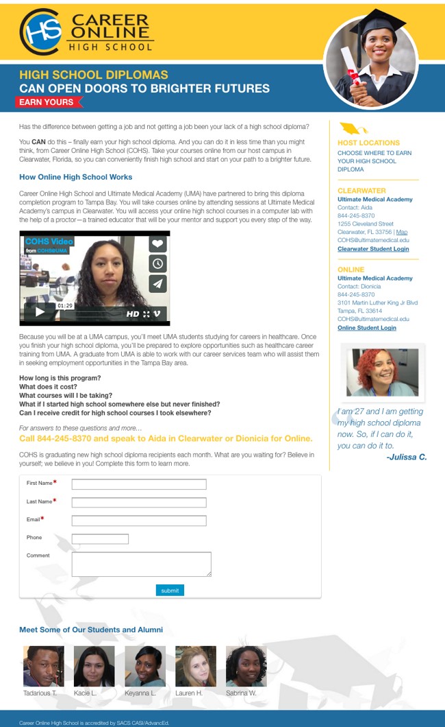
Career Online High School

I realize now the yellow headlines were a bad choice.
But the banner image of the grad in a circle breaking the plane is a nice treatment of a stock image.
And the floating grad caps are a nice, subtle touch.
Generally, not a bad one-pager.

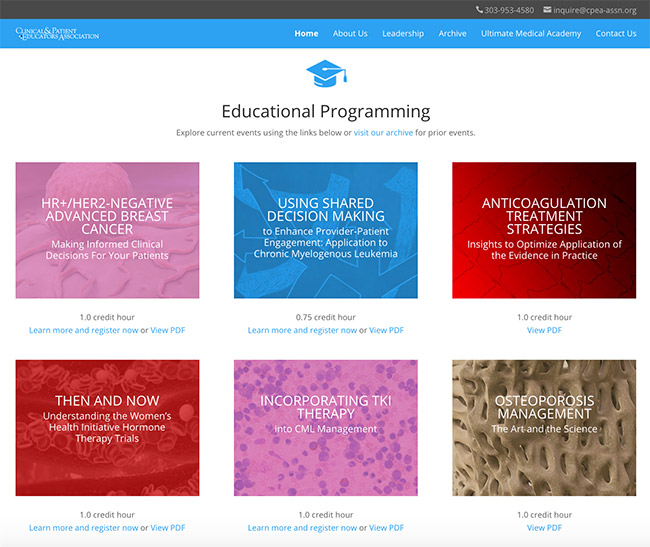
Client & Patient Educators Association


The tricky bit here was to make a site with not much content or imagery seem exciting. Or, at least not boring.
The homepage video gives some movement and disguises an undefined brand identity. Bright colors and interesting imagery on the programming touts try to enliven arcane, technical programming.
The profile pictures were wildly different, so we went black and white for some consistency and authority. This site won't win any awards, but it's a good example of making the best of what you have.